Ambition and Urgency Shape the New Redesign Health Brand
It’s easy to become attached to Redesign Health’s vision to make humanity healthier. Healthcare is public and personal, macro and micro, immediate and long term. All of us have experiences with healthcare. We firmly believe healthcare can and should be better: more accessible, safer, of higher quality. Today, we’re thrilled to share our rebrand, which embodies both our aspirations for the future and the urgency that this moment in healthcare demands.
Looking to the Future
We’re a company that is deeply interested in transformation. We’re not resistant to change, we’re insistent on it. We’re constantly asking, how can we push the envelope? What’s coming next? How can we get ahead of the future or, even better, define it? And what’s unique about us is that when we get the answer or a great idea, we go for it; we go big and do it with unmatched speed and confidence.
Our new brand is the culmination of conversations with people from all levels of the organization — those who have been with Redesign since the beginning to people who just walked in the door. We listened to founders, partners, and industry experts.
Our brand reflects our ambitious mission and speaks to how we are powering innovation and developing technologies, tools, and insights that lower the barriers to change in healthcare.
Building a new institution
Anytime you’re developing a brand, you must uncover the central idea that defines what is unique about your company; that idea becomes the north star. For us it was: We’re creating an institution with the power to rapidly advance human health. An institution is an organization broadly associated with a specific purpose and shaped by the collective actions of many. An institution has long term aspirations that outlive its creators. An institution creates bold impact because of the strength of its network and connectivity.
Defining what a modern institution can be deeply resonated with us: it evoked the urgency of this moment in healthcare and the “hugeness” of what we wanted to accomplish.
From that point on, we had something to measure our designs against. If our colors, typeface, or logo didn’t look that big or speak to that urgency, they didn’t work.
Our Logo
Part prism, part healthcare cross, the central symbol represents Redesign Health’s multifaceted approach to changing healthcare across the entire spectrum of the industry.
Instead of starting one company from one perspective, we believe that the only way you can make impactful change is to build hundreds of companies, incorporating countless perspectives, into a unified vision for change at speed.
The symbol tells us where we want to go and what we want to be, beyond where we are now. And as the omnipresent fixture in our branding and the world we create, it will be something we use to tell our story forever.
Our Colors
Our brand has a bold color palette with a lot of range — from black to neon green. The energy can be dialed up for instances when we want to catch a lot of attention, or pulled back for more formal uses. Our vibrant colors and bright greens and oranges are bolder than anything else in the healthcare space, just like our ambitions.
Our Typeface
Our typeface leaves room for bold, inventive moments, as well as everyday communication. We leaned into a set of dynamic Serifs — rare in present day healthcare — that speak to our commitment to long-term solutions without feeling staid or stationary. Supporting typeface brings an elegance to our day to day communications. Paired with challenging colors and striking graphics, we hope the set brings an institutional wisdom and progressive sensibility to every brand interaction.

Becoming a Symbol
We went through this rebrand at an urgent moment in healthcare, amidst the pandemic that put a stark focus on the challenges in our healthcare industry. But rather than pose a challenge, this moment gave our work even more purpose and perspective. We‘re building something not just for the next year or ten years, but to last the next hundred years. Embracing that perspective only happens when you work at a place like Redesign Health, a place that nurtures bold, unexpected, and diverse ideas.
Ultimately, we hope our brand becomes a symbol in the world of health. We hope it influences not only how we continue to approach our work, but also the type of people that want to join us and the way our industry tackles big challenges — namely, with more ambition, urgency, and perspectives.

The Redesign Health team is focused on the belief that the only way to change healthcare is at scale. The more companies built at Redesign, the more high-quality experiences we can bring to people and patients, and the more likely we are to have a tangible impact on our healthcare system. Learn more about Redesign Health Operating Companies here.
![No alternate text]() Redesign HealthKins Raises $7 Million Series A and Inks Strategic Investment to Bring Kins to New Markets
Redesign HealthKins Raises $7 Million Series A and Inks Strategic Investment to Bring Kins to New MarketsInvestment will accelerate Kins’ hybrid physical therapy expansion into Washington, D.C.; Maryland and Virginia
July 24, 2024
![No alternate text]() Redesign HealthGiving Independent Medical Practices the Cash Flow They Need to Thrive
Redesign HealthGiving Independent Medical Practices the Cash Flow They Need to ThriveThrivory is an end-to-end financial partner, providing convenient, risk-free access to capital
May 14, 2024
![No alternate text]() Redesign HealthMaking Comprehensive Care a Reality for Residents of Senior Living Communities
Redesign HealthMaking Comprehensive Care a Reality for Residents of Senior Living CommunitiesTroupe Health extends the reach of primary care physicians to improve health outcomes for older adults
April 09, 2024
![No alternate text]() Redesign HealthPioneering Specialist Physician Enablement:
Redesign HealthPioneering Specialist Physician Enablement:WindRose Acquires Company Built at Redesign Health
WindRose Acquires Company Built at Redesign Health
April 02, 2024
![No alternate text]() Redesign HealthIntroducing Redesign Health’s Newest Venture Chair
Redesign HealthIntroducing Redesign Health’s Newest Venture ChairLou Shapiro will leverage his four decades of healthcare and leadership expertise to guide Operating Companies at Redesign Health
March 26, 2024
![No alternate text]() Redesign HealthSix Takeaways on Healthcare Innovation from ViVE 2024
Redesign HealthSix Takeaways on Healthcare Innovation from ViVE 2024Redesign Health attended ViVE 2024 in Los Angeles. We're sharing the six key takeaways our team observed on what’s driving the industry forward.
March 11, 2024
![No alternate text]() EndocrinologyRedesign HealthInvesting in the Future of Diabetes Care
EndocrinologyRedesign HealthInvesting in the Future of Diabetes CareWith a combination of insights, technology and care, Valendo Health empowers independent endocrinologists to grow their practices
March 05, 2024
![No alternate text]() Redesign HealthRewriting the Script on Comprehensive Medication Management
Redesign HealthRewriting the Script on Comprehensive Medication ManagementScriptology combines an extended clinical pharmacy team with technology, creating proven benefits for patients, providers and payers
February 21, 2024
![No alternate text]() Redesign Health2023 Redesign Health Recap
Redesign Health2023 Redesign Health RecapAs we wrap up the year, here's a recap of some of our most exciting moments.
December 14, 2023
![No alternate text]() DementiaRedesign HealthBridging the Gaps in Dementia Care for Providers, Patients and Caregivers
DementiaRedesign HealthBridging the Gaps in Dementia Care for Providers, Patients and CaregiversHarmonic Health leverages technology and expertise to create a new evidence-based dementia care model.
November 21, 2023
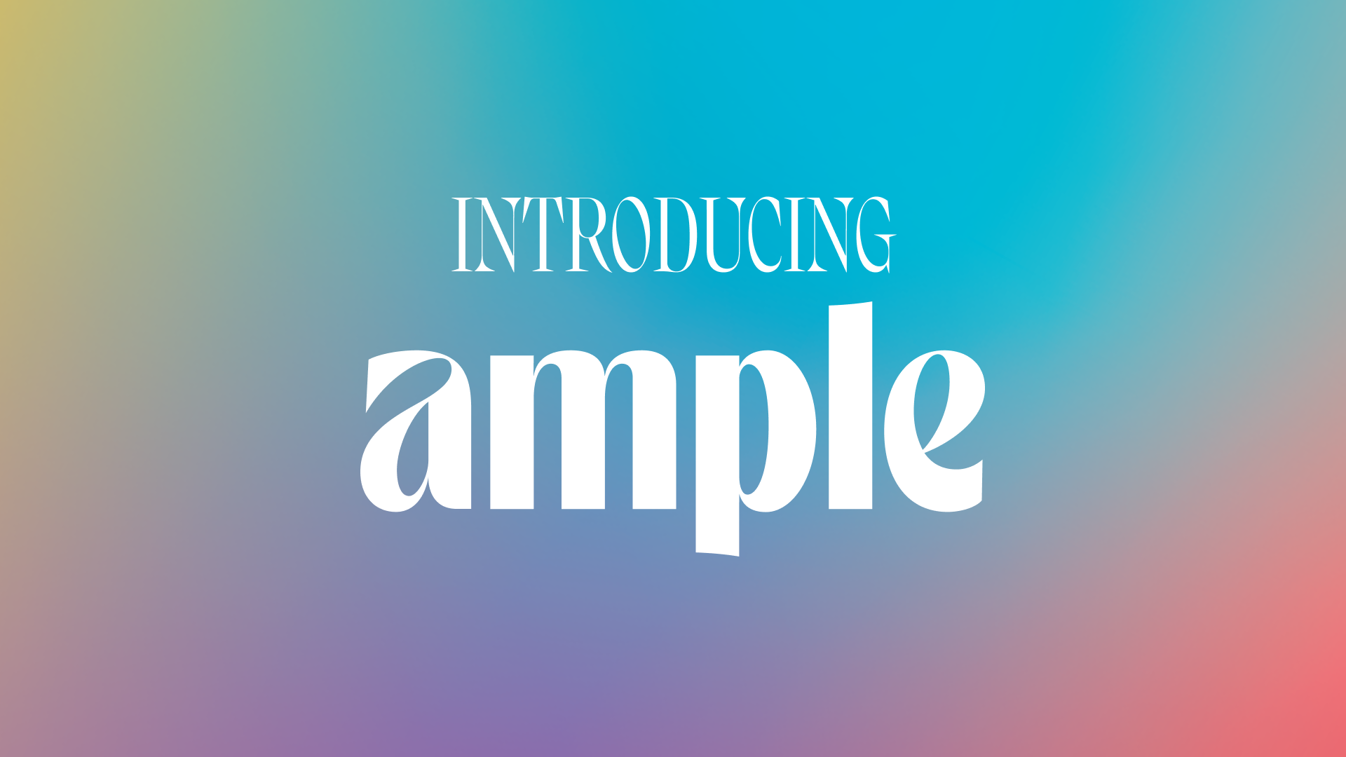
![No alternate text]() Redesign HealthReshaping the Hair Restoration Journey
Redesign HealthReshaping the Hair Restoration JourneyAmple combines clinical expertise and personalized care to make hair restoration approachable and empowering.
November 02, 2023
![No alternate text]() Redesign HealthUnlocking Innovation: The Power of Strategic Partnerships in Healthcare
Redesign HealthUnlocking Innovation: The Power of Strategic Partnerships in HealthcareAt the 2023 Re View Summit, we brought together industry experts from across the healthcare landscape for a discussion that explored how startups can more effectively partner with incumbents. Here are their insights.
October 26, 2023
![No alternate text]() Redesign HealthUnleashing the Power of Generative AI and LLMs in Healthcare: Insights from Industry Experts
Redesign HealthUnleashing the Power of Generative AI and LLMs in Healthcare: Insights from Industry ExpertsAt the 2023 Re View Summit, AI Panelists explored how CEOs can get started, viable opportunities within the market and what investors and health systems are seeking when it comes to practical solutions.
October 24, 2023
![No alternate text]() Redesign HealthHLTH 2023: 6 Emerging Microtrends for Healthcare Innovators
Redesign HealthHLTH 2023: 6 Emerging Microtrends for Healthcare InnovatorsWe're sharing the six microtrends we kept hearing about at HLTH 2023 that we expect to shape the early-stage company landscape in the years to come.
October 18, 2023
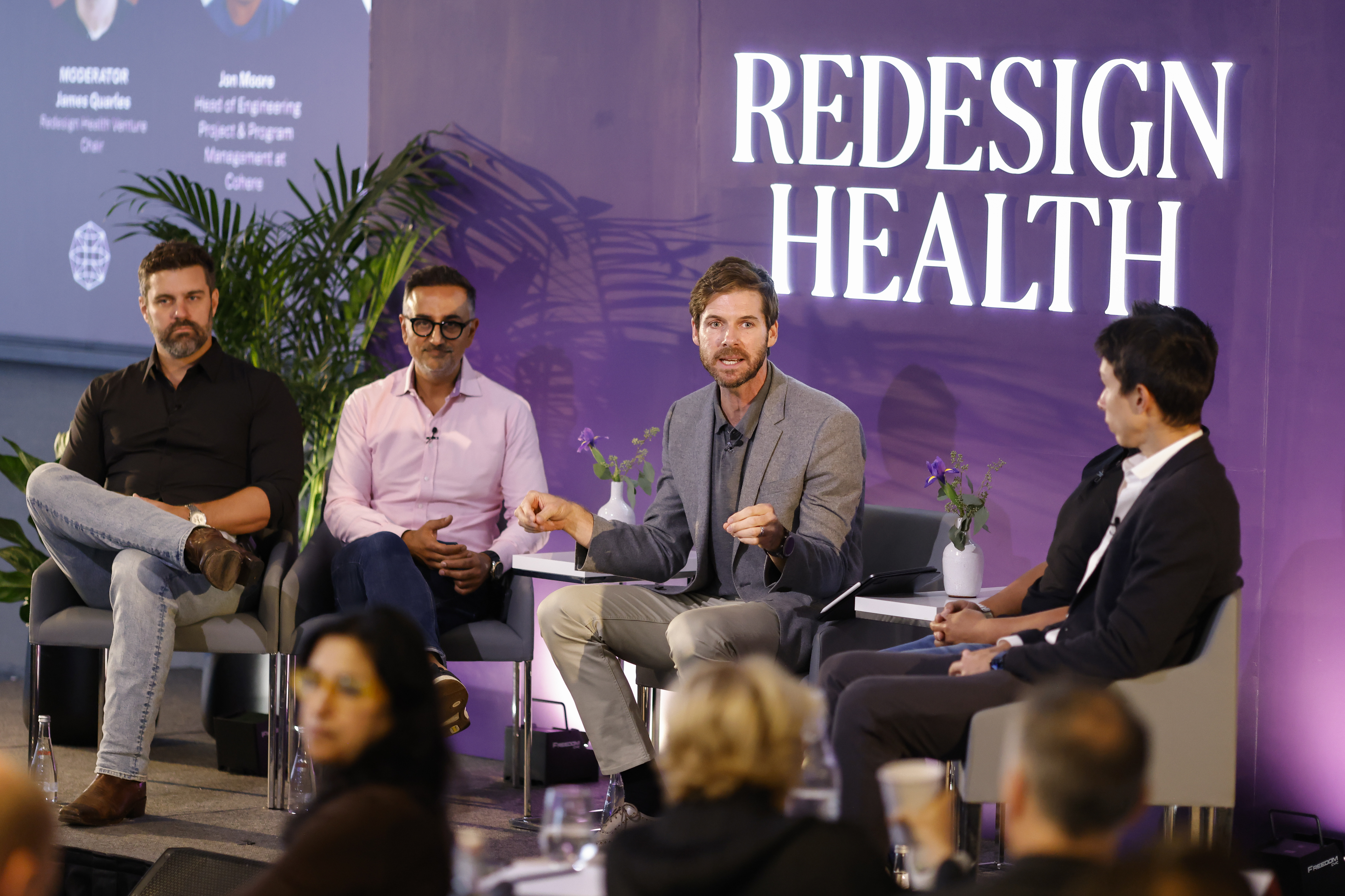
![No alternate text]() CEORedesign HealthFrom Startups to Scaling: Key Takeaways from the 2023 Re View Summit
CEORedesign HealthFrom Startups to Scaling: Key Takeaways from the 2023 Re View SummitDuring our recent Re View Summit, we gathered 40+ CEOs from the Redesign Health community to tackle some of the most pressing issues in healthcare through panels, workshops and networking. Here are some of the highlights.
October 12, 2023
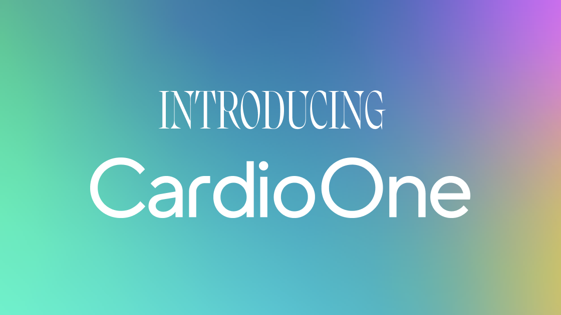
![No alternate text]() CardiologyRedesign HealthUnlocking the Full Potential of Independent Cardiology Practices
CardiologyRedesign HealthUnlocking the Full Potential of Independent Cardiology PracticesCardiology care delivery enablement platform CardioOne builds early momentum through partnerships with independent cardiology practices and MedAxiom.
October 03, 2023
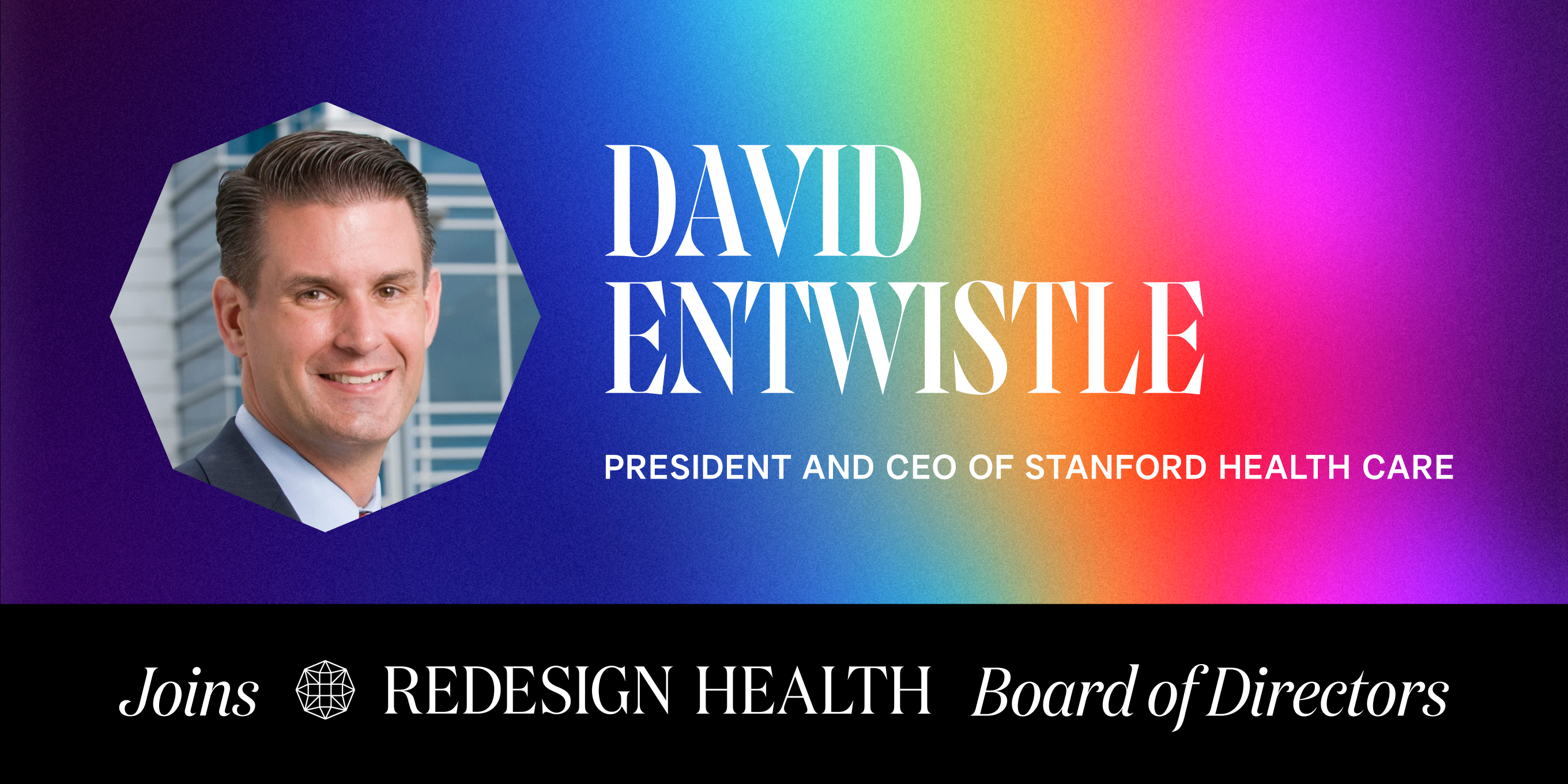
![No alternate text]() Redesign HealthDavid Entwistle, President and CEO of Stanford Health Care, Joins Redesign Health Board of Directors
Redesign HealthDavid Entwistle, President and CEO of Stanford Health Care, Joins Redesign Health Board of DirectorsWe’re thrilled to welcome David Entwistle, President and CEO of Stanford Health Care, to our Board of Directors.
August 17, 2023
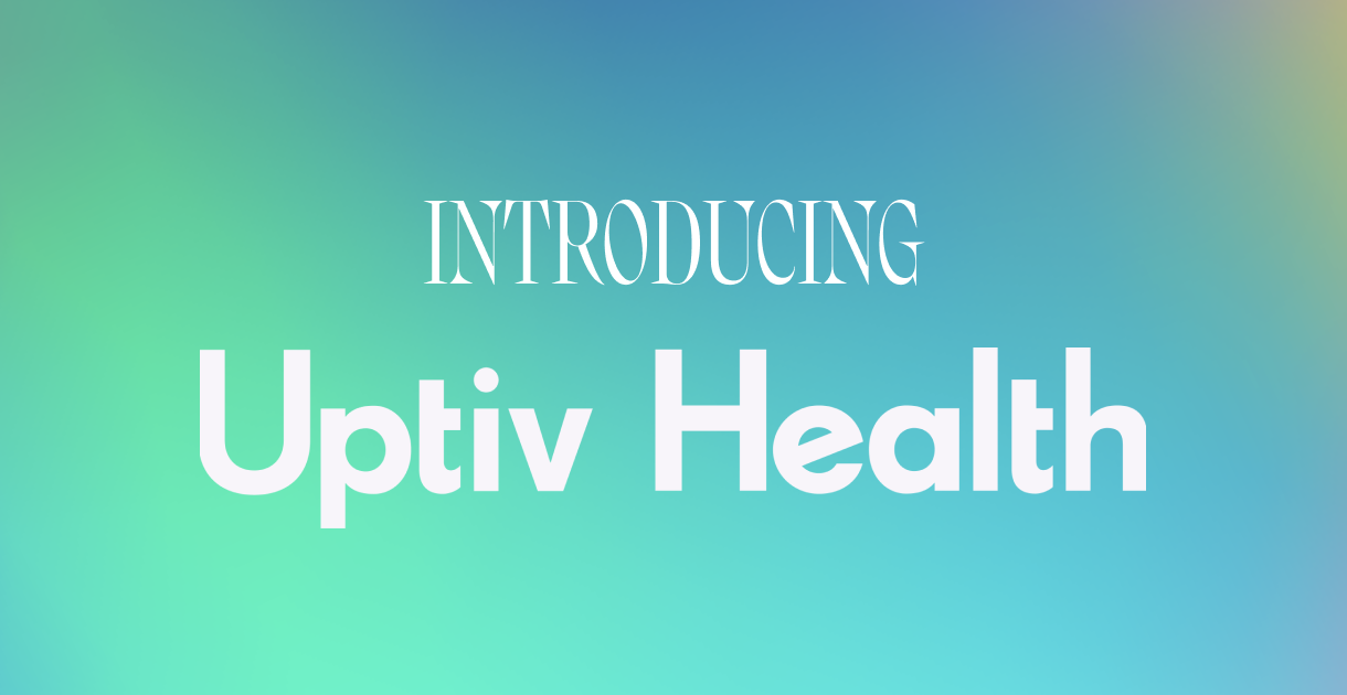
![No alternate text]() Chronic CareRedesign HealthInfusing Innovation Into Care for Chronic Illnesses
Chronic CareRedesign HealthInfusing Innovation Into Care for Chronic IllnessesUptiv Health transforms the transactional treatment model centered on pharmaceutical support to one that’s focused on the whole person, empowering patients while prioritizing their health and well-being.
August 10, 2023
![No alternate text]() Mental HealthRedesign HealthMaking a Clinical Impact: UpLift's Integrated Behavioral Health Model Increases Access to High-Quality Psychotherapy and Psychiatry
Mental HealthRedesign HealthMaking a Clinical Impact: UpLift's Integrated Behavioral Health Model Increases Access to High-Quality Psychotherapy and PsychiatryEarly traction secures $10.7M in Series A funding and a new Medicaid MCO partnership that will form a first-of-its-kind clinically integrated network (CIN) to expand behavioral healthcare access for Medicaid members in Washington, D.C.
August 08, 2023
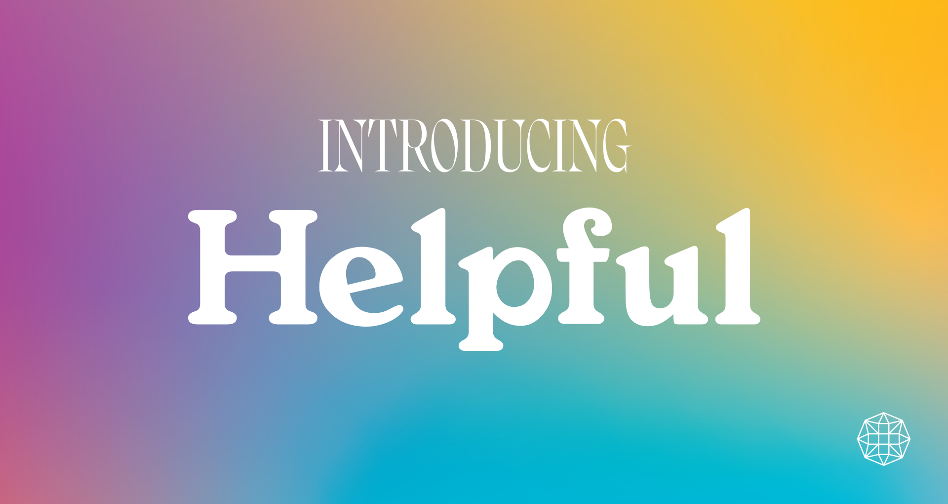
![No alternate text]() CaregivingRedesign HealthModernizing the Caregiving Experience
CaregivingRedesign HealthModernizing the Caregiving ExperienceWe’re proud to introduce a groundbreaking platform designed to meet caregivers’ unique challenges.
August 01, 2023
![No alternate text]() Healthcare LaborRedesign HealthReimagining the Healthcare Labor Pool Through Innovation
Healthcare LaborRedesign HealthReimagining the Healthcare Labor Pool Through InnovationIn our latest blog post, we look at trends shaping the imbalance of healthcare staffing supply and demand and explore the ecosystem of Operating Companies at Redesign Health that we’ve built to help health systems ease the labor crisis.
July 28, 2023
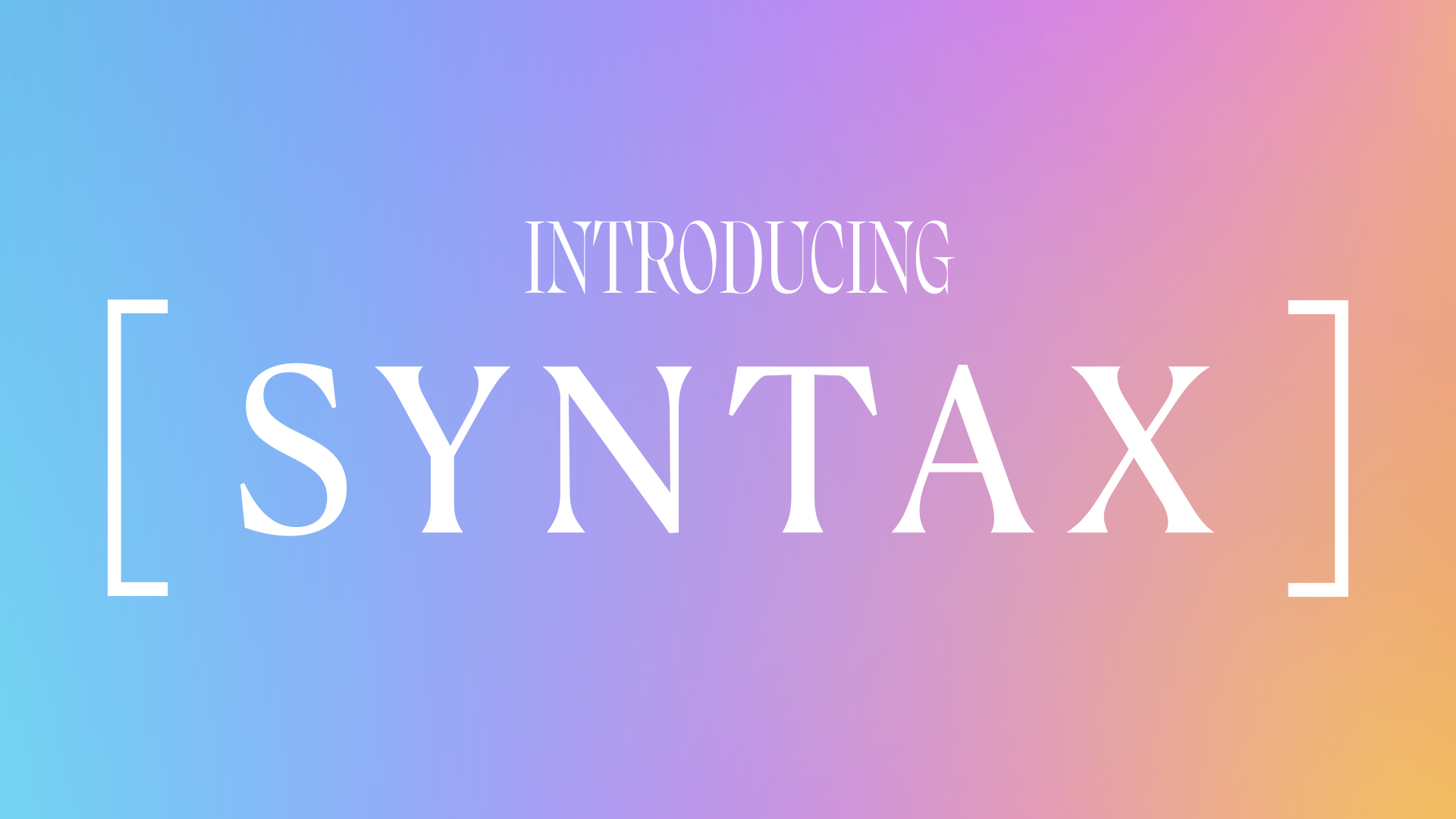
![No alternate text]() Value-Based CareRedesign HealthBreaking Down Barriers to Value-Based Care Contracting: Simplifying the process through collaboration, real-time insights and comprehensive data
Value-Based CareRedesign HealthBreaking Down Barriers to Value-Based Care Contracting: Simplifying the process through collaboration, real-time insights and comprehensive dataSyntax is an enterprise SaaS platform that simplifies and demystifies how contracts are created and completed for all parties involved. With Syntax, teams can obtain a full view into what a value-based contract will look like in practice.
July 18, 2023
![No alternate text]() Cardiac CareRedesign HealthExpanding Access to Cardiac Rehabilitation with Whole-Person, At-Home Care
Cardiac CareRedesign HealthExpanding Access to Cardiac Rehabilitation with Whole-Person, At-Home CareEach year, more than 1 million Americans become eligible for cardiac rehabilitation. We’re thrilled to launch a new company designed to reshape the way patients receive cardiac rehabilitation.
June 15, 2023
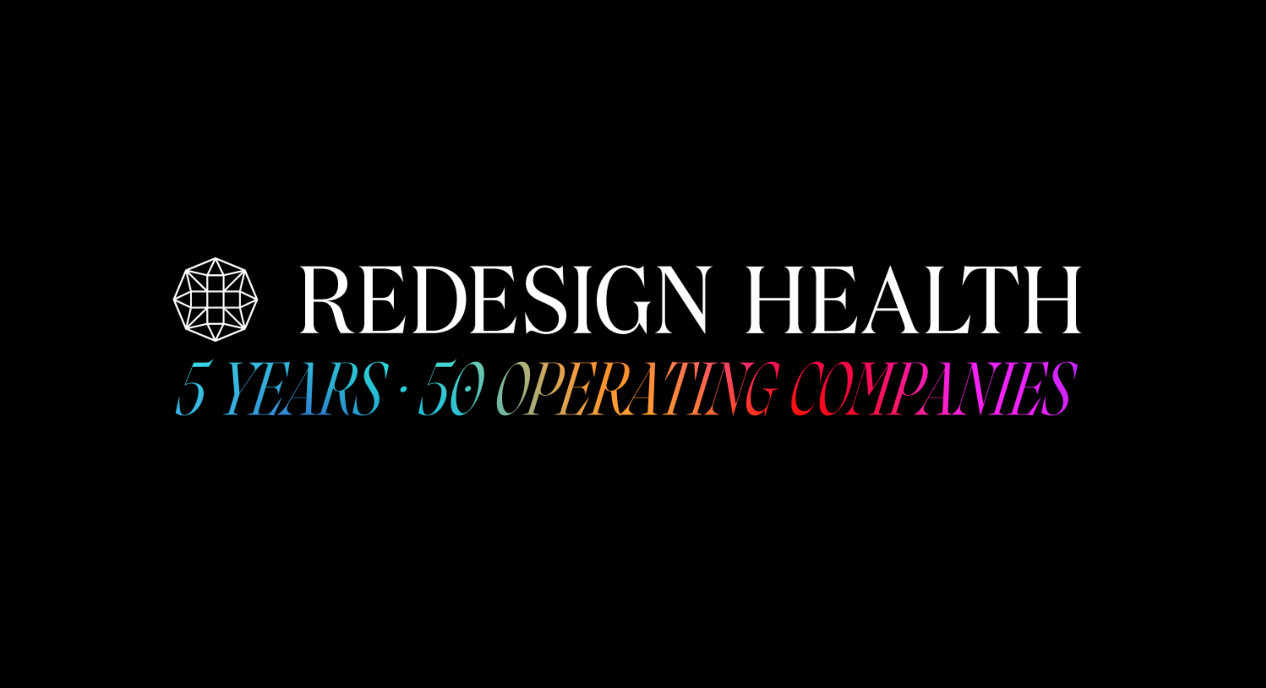
![No alternate text]() Redesign HealthRedesign Health: A 5-Year Milestone of Innovation & Impact
Redesign HealthRedesign Health: A 5-Year Milestone of Innovation & ImpactAs we stand at the cusp of the next wave of change, we wanted to look back on what we’ve done so far and share where we — and the industry — are going next.
May 31, 2023
![No alternate text]() Redesign HealthCelebrating Five Years of Redesigning Health for Everyone
Redesign HealthCelebrating Five Years of Redesigning Health for EveryoneFive years ago, we realized the only way to create real change in healthcare is at scale. Now, we’re proud to have powered the launch of more than 50 healthcare companies.
April 20, 2023
![No alternate text]() Redesign HealthRedefining Pet Care for Modern Pet Parents and Veterinarians
Redesign HealthRedefining Pet Care for Modern Pet Parents and VeterinariansToday’s pet owners don’t just adopt animals—they treat them as members of their family.
April 12, 2023
![No alternate text]() Our Key Takeaways from ViVE 2023
Our Key Takeaways from ViVE 2023Redesign Health attended ViVE 2023 in Nashville last week, where Redesigners and leaders from our Operating Companies connected with industry innovators and attended thought provoking panel discussions.
April 03, 2023
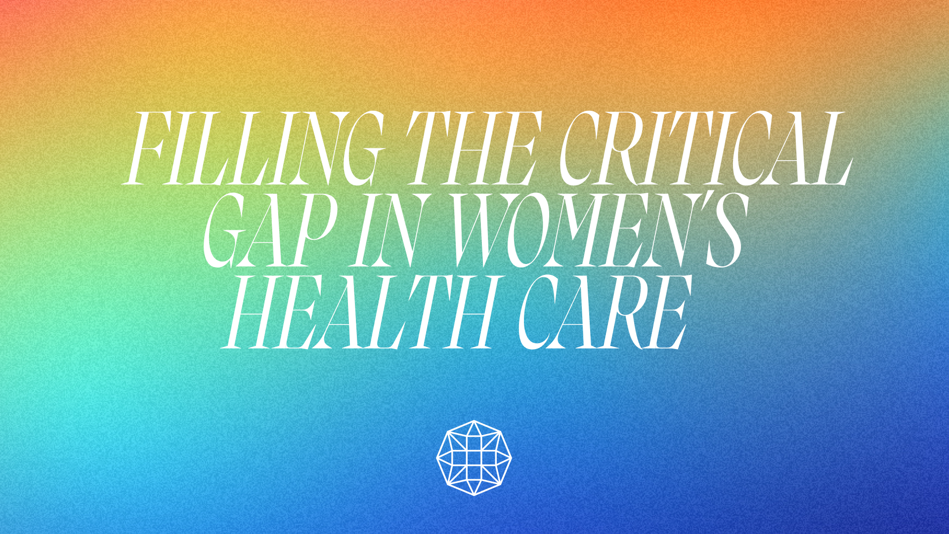
![No alternate text]() Lesley SolomonFilling the Critical Gap in Women’s Health Care
Lesley SolomonFilling the Critical Gap in Women’s Health CareWomen in the United States are facing a troublesome, fragmented patchwork of care options, caused by a variety of challenges.
February 28, 2023
![No alternate text]() 2022 Year in Review
2022 Year in ReviewIt was an exciting year for Redesign Health!
December 19, 2022
![No alternate text]() HLTHRedesign HealthOur Key Takeaways from HLTH 2022
HLTHRedesign HealthOur Key Takeaways from HLTH 2022Redesign Health attended HLTH 2022 in Las Vegas last week, where Redesigners and leaders from our Operating Companies connected with industry innovators and attended thought provoking panel discussions.
November 21, 2022
![No alternate text]() Redesign HealthOur Biannual Redesign Health Cares Day
Redesign HealthOur Biannual Redesign Health Cares DayLast week, Redesign Health held its Redesign Health Cares Day in celebration of World Kindness Day on November 11.
November 17, 2022
![No alternate text]() PartnershipsRedesign HealthPartnering With Leading Children's Hospitals to Identify and Build Innovative Pediatric Healthcare Solutions
PartnershipsRedesign HealthPartnering With Leading Children's Hospitals to Identify and Build Innovative Pediatric Healthcare SolutionsAt Redesign Health, we firmly believe the US healthcare system desperately needs innovation to address our lagging health outcomes, sky-high costs and uneven access to care.
November 03, 2022
![No alternate text]() Redesign HealthRedesign Health at HLTH 2022
Redesign HealthRedesign Health at HLTH 2022We are excited to share that Redesign Health team members and leaders from a number of our Operating Companies will attend HLTH in Las Vegas later this month.
November 02, 2022
![No alternate text]() CEORe View Summit Recap
CEORe View Summit RecapWe recently brought together 30+ of our founding CEOs and Venture Chairs for the inaugural Re View Summit, a two-day event focused on the best practices for successfully scaling businesses.
September 29, 2022
![No alternate text]() Redesign HealthOur Mission to Redesign Health for Everyone
Redesign HealthOur Mission to Redesign Health for EveryoneRedesign Health powers innovation in healthcare by developing technologies, tools, and insights that lower the barriers to change across the industry. Since 2018, exceptional founders have built over two dozen companies at Redesign Health.
September 13, 2022
![No alternate text]() Redesign HealthAmbition and Urgency Shape the New Redesign Health Brand
Redesign HealthAmbition and Urgency Shape the New Redesign Health BrandOur new brand is the culmination of conversations with people from all levels of the organization — those who have been with Redesign since the beginning to people who just walked in the door. We listened to founders, partners, and industry experts.
April 21, 2022